
Learn through play. Understand through design.
Made to Be Played
All the design. All the content. All the experience – in one place

I believe that great design starts with listening — deeply understanding the client’s needs, thinking about the end users, and crafting a visual and functional experience that truly works.
With experience in graphic design, illustration, UI/UX, and marketing video editing, I combine creativity with practical thinking to bring ideas to life in a way that’s both beautiful and effective.
Whether it’s designing a product, logo, website, or video, I love being involved in every stage of the process — from ideation to final execution.
Feel free to explore my projects and get a sense of how I create memorable experiences — always grounded in collaboration, reliability, and attention to detail.
Banner Design for Business Clients
A selection of banners designed for various companies and businesses. Each design is customized to match the brand's visual identity and marketing goals – with attention to layout, typography, and audience appeal.
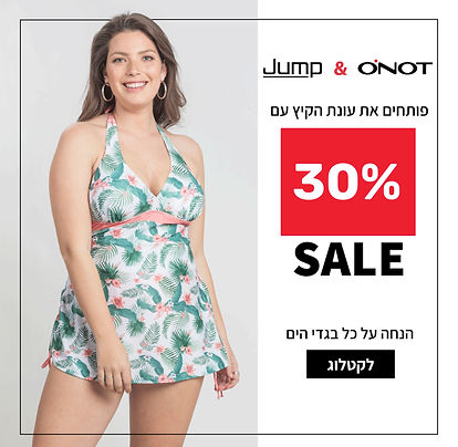
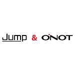
Client - Jump & Onot
Designed a summer promotion banner featuring the discount, model imagery from the brand catalog, and clear typography – all styled according to the brand’s visual language.
.png)
Client - Physiopilates Studio
Designed a new pricing table suitable for both print and digital use.
The client provided a previous banner with an existing visual style, and it was important to maintain the brand’s familiar look and feel. I created a fresh design that aligns with the original colors and aesthetics, while improving clarity and overall user experience.
The design features calming colors, accessible typography, clear icons, and real studio imagery to create a sense of connection and authenticity.
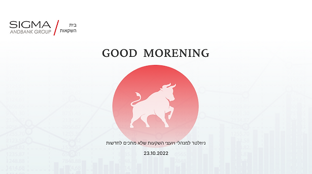
SIGMA - Investment House
Designed a daily banner for a financial newsletter sent to investment advisors. I created a custom bull illustration and suggested its use after researching its symbolic relevance to the stock market (bullish market). The design features clean colors and formal typography, aligned with the brand’s visual identity.
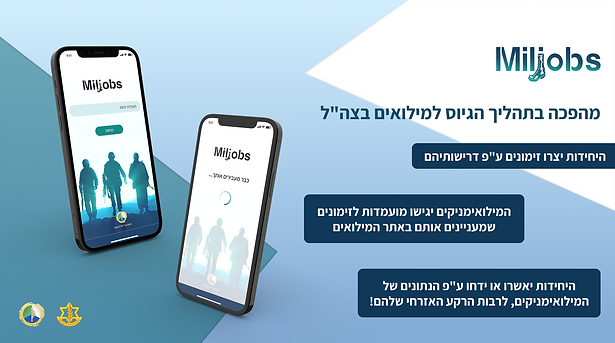
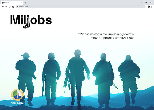
Israeli Navy Recruitment Unit – MilJobs
Designed an explanatory banner for a dedicated website aimed at reservists in the IDF. The goal was to clearly present the registration steps, using icons, concise text, and graphic treatment of the existing app interface.
In addition, I was asked to design a logo for the project and develop the website’s UI – these elements will be showcased in a separate project section.
Business Cards for Clients
Designed business cards for clients from various industries, aligning each layout with the brand’s visual language. Focused on clean composition, readable typography, and a balanced use of color and branding elements to create a professional and memorable design.
.png)
MYQ – an educational startup working with the Ministry of Education, delivering digital lessons in private schools across Israel and abroad that combine games with active learning experiences
Designed a business card aligned with the company’s brand language, featuring clean typography, clear colors, and a graphic representation of sub-brands within a unified design style.
.png)
.png)
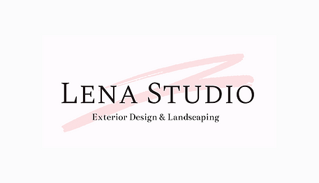
Lena Studio – a design studio specializing in interior design, architecture, and landscape design
Created a personalized logo and business card based on the client’s preferences.
The design features soft colors, elegant typography, and a feminine style, reflecting the studio’s refined aesthetic and multidisciplinary approach.
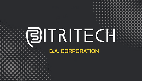
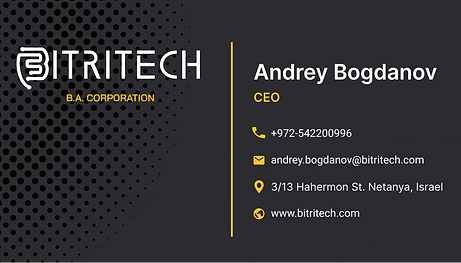
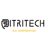
Bitritech - A tech company providing cloud server solutions to high-tech firms in Israel and abroad
Designed the company logo and a double-sided business card with a clean, dynamic, tech-oriented look.
The design uses a dark palette with yellow accents to emphasize innovation and trust, enhanced by data-inspired graphic patterns.
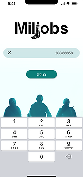
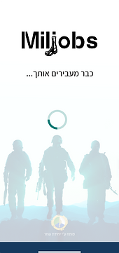
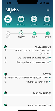
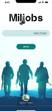
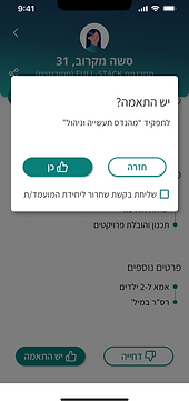
MilJobs – a mobile platform for managing reservist enlistment in the IDF
Complete UI/UX design for a mobile application – including logo design, color palette, custom icons, and key interface screens.
The design was tailored for a diverse target audience: active soldiers, reservists, civilians, and a wide age range.
To support this, I focused on:
-
High readability – with clear fonts and strong contrast.
-
Simple, accessible language – avoiding technical jargon.
-
Clear navigation and intuitive buttons – for non-tech-savvy users.
-
Visual elements and icons referencing military aesthetics – to build instant recognition and familiarity.
Only selected screens are shown here; the full app includes dozens of additional pages.
Due to security restrictions, full access is available upon request.
Desktop
Login with value
Loading page
Job Creation
Mobile
Login default
Profile Page
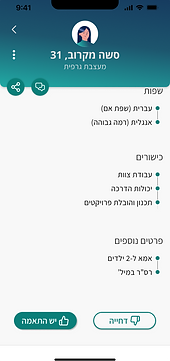
Profile Page
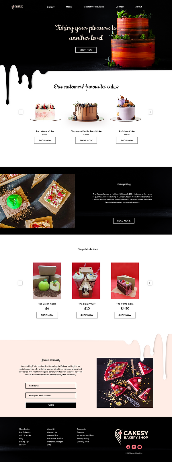
Sprinkles – a bakery chain based in Tel Aviv
Created a full homepage mockup, designed for both desktop and mobile.
The layout reflects the brand’s identity with dessert-themed visuals, product categories, a signup form, and a styled footer.
The current version includes placeholder text and logo, and will be updated with final content once it’s provided.
The design was approved by management and is ready for content implementation.
Web
Designed for large screens, the desktop version features a wide content layout, horizontal navigation, and side-by-side elements. Since users interact via mouse and keyboard, the focus is on clean visuals, clear hierarchy, and easy information flow — ideal for extended browsing and in-depth exploration.
Mobile
The mobile version is fully optimized for a seamless one-handed experience. Buttons are sized to accommodate fingers of all shapes — thin or wide — and text remains highly readable on smaller screens.
Every detail was carefully considered: from spacing between elements and accessible color contrasts, to intuitive navigation and form usability. The goal was to ensure that users of all ages, tech abilities, or physical conditions can browse and interact comfortably.

Meaningful Projects – Design with Insight
Healthy Juice Brand Website – Personal Concept
This is a design I created as a personal exercise to explore a website layout for a natural juice brand.
The goal was to craft a clean, fresh, and nature-inspired interface that reflects values of wellness, freshness, and a sustainable lifestyle.
The design uses light colors, natural textures (such as wood and sliced fruit), airy and playful typography, along with a clear menu and smooth scrolling experience.
The layout presents the products, brand values, and purchase options in a user-friendly way, using a clear visual hierarchy to ensure an intuitive and high-quality user experience.
.png)
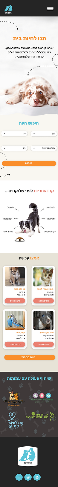
Pet Adoption Website & Mobile Design
A design project created for a client in the pet adoption field.
The goal was to create a warm and user-friendly experience that appeals to both families and individuals.
I also designed the logo, tailored to match the site’s visual identity.
The design features soft colors, readable typography, clear icons, and intuitive layouts to create an emotional connection and sense of empathy.
The site is fully responsive and optimized for both desktop and mobile – making the adoption process as easy and welcoming as possible.
Marketing Video Editing with a Personal Touch
In these projects, I wasn’t just editing videos – I also helped craft the marketing messages, adapt the content to the target audience, and create a viewing experience that feels both fun and professional.
I believe that good communication and teamwork are key to a successful creative process, and I always aim to keep things clear, collaborative, and aligned with the brand’s goals.
Engaging Marketing Content
Edited to attract new clients by highlighting a dynamic, professional atmosphere. Includes catchy text, clean framing, and an energetic rhythm tailored for platforms like Instagram and TikTok.

Personal Branding & Trust Building
A video featuring the trainer speaking directly to the audience, designed to create a sense of authenticity and personal connection. The edit emphasizes confidence, approachability, and professionalism – essential for building a strong personal brand online.

Brands and organizations that chose to work with me
Here you can find a selection of clients I’ve collaborated with on graphic language development, interface design, marketing materials, and brand identity – all tailored precisely to their needs and vision.


.png)

All the creativity. All the thinking. All the value — all in one place
Throughout this page, you’ve seen the creative worlds I bring to life:
Original illustrations, UI/UX design for apps and websites,
Brand identity and visual language development,
Promotional video editing,
Fully responsive layouts for both desktop and mobile, and collaborations with educational institutions, government bodies,
startups, and private businesses.
I'm here to help you turn ideas into clear, compelling visual experiences.
Looking for someone creative, reliable, and a true team player?
You’ve come to the right place.